Why do my watercolours turn muddy?
You wanted a fresh spring green. What came out was a dull, swampy olive. If this has happened to you, please know it isn’t a lack of talent. It’s a little colour theory nobody explained to you yet.
I spent 14 years as a data scientist before I became a full-time watercolour artist. I love a system. And colour, it turns out, has a very gentle, very learnable system underneath it.
In this colour theory for beginners guide, you’ll learn 5 easy secrets:
- what hue, value and saturation actually mean
- why every colour is either warm or cool (even your blues)
- the one mixing habit that causes most muddy colour
- how to mix soft, glowing greys for shadows
- a 15-minute exercise you can try today
Colour theory for beginners: the colour wheel in three plain words
Colour theory for beginners starts with three simple ideas. Every colour you paint can be described by them. Once you can name them, you can fix almost any colour on your palette.
| Word | What it means | Ask yourself |
| Hue | The colour family: red, yellow, blue, green and so on | Which family is this? |
| Value | How light or dark it is | Would this look light or dark in a black-and-white photo? |
| Saturation | How bright or soft it is | Is it singing or whispering? |
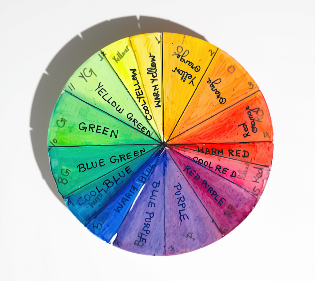
The colour wheel simply places the hues in a circle. Primaries (red, yellow, blue) can’t be mixed. Secondaries (orange, green, violet) sit between two primaries. Colours next to each other are neighbours. Colours straight across the wheel are opposites, also called complementary colours. Keep those two words in mind; they matter in a moment.
In watercolour, value has a special twist: we make colours lighter with water, not white paint. More water, lighter value.
Every colour is warm or cool, even your blues
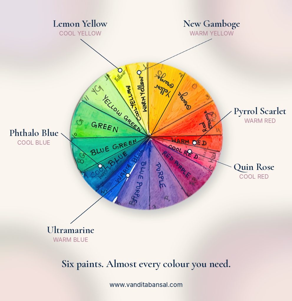
We usually call reds and yellows warm and blues cool. But look closely and each primary comes in two moods. A warm red leans towards orange; a cool red leans towards violet. Temperature is also relative: a colour looks warmer or cooler depending on what sits beside it.
This is why I teach the split-primary palette: one warm and one cool version of each primary. Six paints, and you can mix almost anything cleanly.
| Primary | Warm version (leans to) | Cool version (leans to) |
| Red | Cadmium Red or Pyrrol Scarlet (orange) | Permanent Alizarin Crimson or Permanent Rose (violet) |
| Yellow | New Gamboge (orange) | Hansa Yellow Light (green) |
| Blue | French Ultramarine (violet) | Phthalo Blue (green) |
You don’t need expensive tubes to start. Most artist-grade and student ranges sold in India include close versions of these. Look at the pigment name on the label rather than the colour name. My full supply list is in the free beginner’s guide linked below.
The quiet reason colours turn muddy
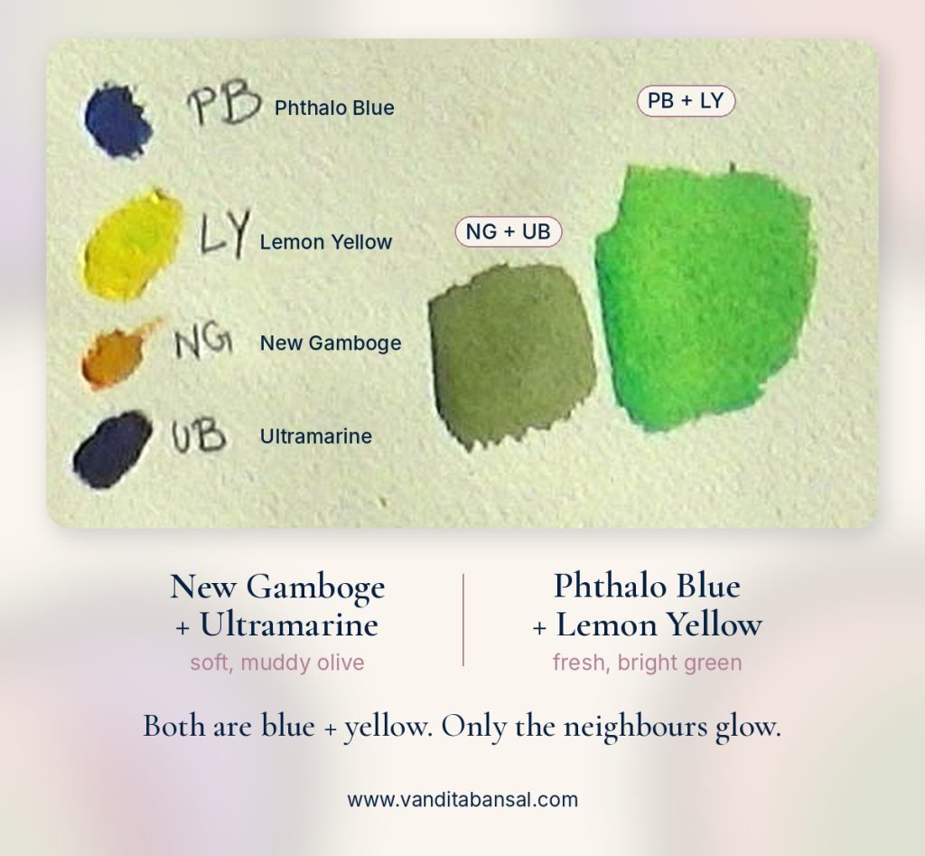
Most muddy colour comes from one habit: mixing two paints that secretly contain the opposite of the colour you want.
Take green. French Ultramarine leans towards violet, and New Gamboge leans towards orange. Violet and orange both carry a little red, and red is green’s opposite. So the mix comes out dull and olive. Now mix Phthalo Blue with Hansa Yellow Light. Both lean towards green, so they meet as neighbours, and the green glows.
| You want | Mix these neighbours (clean, bright) | Avoid for brightness |
| Fresh green | Phthalo Blue + Hansa Yellow Light | Ultramarine + New Gamboge |
| Clear violet | French Ultramarine + Permanent Rose | Phthalo Blue + Cadmium Red |
| Glowing orange | New Gamboge + Cadmium Red | Hansa Yellow Light + Alizarin Crimson |
Three more gentle rules keep colours clean:
- Mix two paints, three at most. Every extra pigment dulls the colour.
- Rinse your brush between colours, and change your water when it looks like tea.
- Let a layer dry fully before glazing over it. Scrubbing into a damp layer lifts and churns the paint below.
Muddy isn’t always wrong, by the way. Those “avoid” mixes make beautiful earthy greens for tree trunks and distant hills. The point is to choose it, not stumble into it.
Opposites make soft, living greys
When you mix two opposites on purpose, they calm each other down into a grey. These greys are far more alive than black or a tube grey, because you can tip them warm or cool.
- Ultramarine + Burnt Sienna (blue and orange): my everyday shadow grey. More blue for cool shadows, more sienna for warm ones.
- Permanent Rose + a green: a gentle, slightly pink grey, lovely for shadows on skin and flowers.
- Violet + New Gamboge: a soft golden grey for evening light.
Add a tiny touch of an opposite to calm a colour that shouts too loudly. A green that looks artificial softens instantly with a whisper of red.
Try it today: a 15-minute colour exercise
You need your six split-primary paints, one sheet of watercolour paper and a pencil.
- Draw two rows of three small squares.
- Top row, clean mixes: Phthalo Blue + Hansa Yellow Light (green), Ultramarine + Permanent Rose (violet), New Gamboge + Cadmium Red (orange).
- Bottom row, the “avoid” mixes of the same colours.
- Label each square in pencil. Let it dry.
- Place the two rows side by side. Notice the difference, then notice which bottom-row colour you secretly like.
Keep this sheet near your palette. It will teach you more than any colour chart you buy.
Before you choose your colours, close your eyes
Colour theory gives you the map. Your feelings choose the destination. Before your next painting, close your eyes and picture the subject. Notice which colours your mind names first, and how it makes you feel: calm, warm, wistful. Then use what you’ve learned here to mix those colours cleanly.
Your instinct already knows what the painting needs. Theory just helps you trust it.
Want to keep going?
- Download my free beginner’s watercolour guide, with my full supply list: vanditabansal.kit.com/beginnersguide
- Paint with me live in Magical Watercolour Beginnings, a gentle 4-week online series for beginners on four Saturdays from 21 November. [Add link to series page]
- Follow along on Instagram @vanditabansal for weekly tips.
Which colour mix always turns muddy for you? Tell me in the comments.
Frequently asked questions
What is the best colour palette for beginners in watercolour? A split-primary palette of six paints: a warm and a cool red, yellow and blue. Add Burnt Sienna for earthy colours and greys.
Why do my watercolours look dull and muddy? Usually from mixing paints that lean towards opposite colours, using more than two or three pigments, dirty water, or working into a damp layer.
Do I need black or white paint in watercolour? No. Use water to make colours lighter, and mix opposites for rich darks and greys.
How long does it take to understand colour mixing? Less time than you think. A few short swatching sessions, like the exercise above, will already show you which mixes stay clean.
Free download: my watercolour supply guide
Not sure what to buy? My free guide lists exactly what I use (paper, paints, brushes and masking fluid) and where to buy each one online in India. It’s a good place to start.


