Have you ever looked at a leaf, a sari or a sunset and thought, “I could never mix that colour”?
I used to feel the same. I would add a little of this and a little of that, and end up with mud on my palette and frustration in my heart.
What changed everything for me was understanding that every colour, however complicated it looks, is made of just three things. Once you know them, you can mix almost any colour you see, one gentle step at a time. And you are allowed to get it wrong along the way. I still do.
Every colour has three parts
When a mix looks “wrong”, it is almost always just one of these three that is off. My method works through them one at a time.
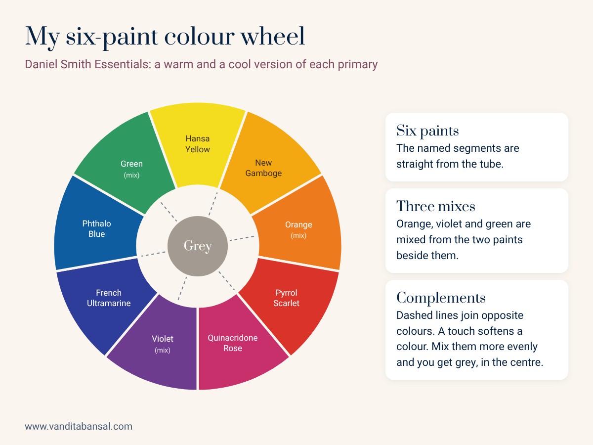
My six-paint colour wheel
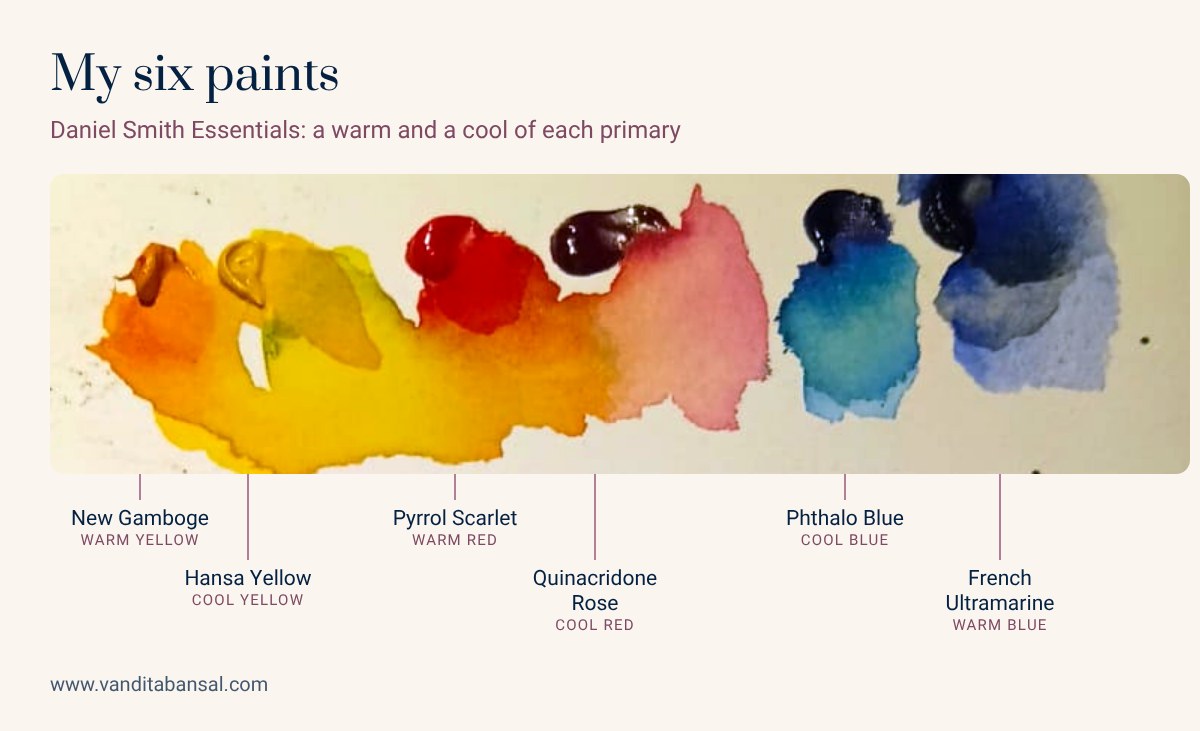
True primary colours don’t exist in paint, so I keep a warm and a cool version of each primary. I mix almost everything from just six colours, all from the Daniel Smith Essentials set:
New Gamboge (warm)
Pyrrol Scarlet (warm)
French Ultramarine (warm)
If you haven’t made your own colour wheel yet, start with my earlier post, Colour Theory for Beginners.
How to mix any colour in 4 steps
Start with the closest hue
Look at the colour you want and ask: where does it sit on my colour wheel? Starting from the closest hue means fewer paints in the mix, and fewer paints means cleaner, brighter colour. Most muddy mixes come from starting too far away and adding colour after colour to get back.
Nudge the hue with the paints beside it
Now get as close as you can by adjusting the amounts. The secret is to pick two colours that lean towards each other:
Vibrant green: Hansa Yellow + Phthalo Blue
Vibrant orange: New Gamboge + Pyrrol Scarlet
Vibrant violet: Quinacridone Rose + French Ultramarine
Set the value with water
In watercolour, we don’t add white to make a colour lighter. We add water and let the paper shine through. To go darker, use more pigment, or let a layer dry and glaze the same colour over it. Always test on a scrap of the same paper and let it dry: watercolour dries lighter than it looks when wet. In oils or acrylics you would use white instead of water.
Soften the saturation with the complement
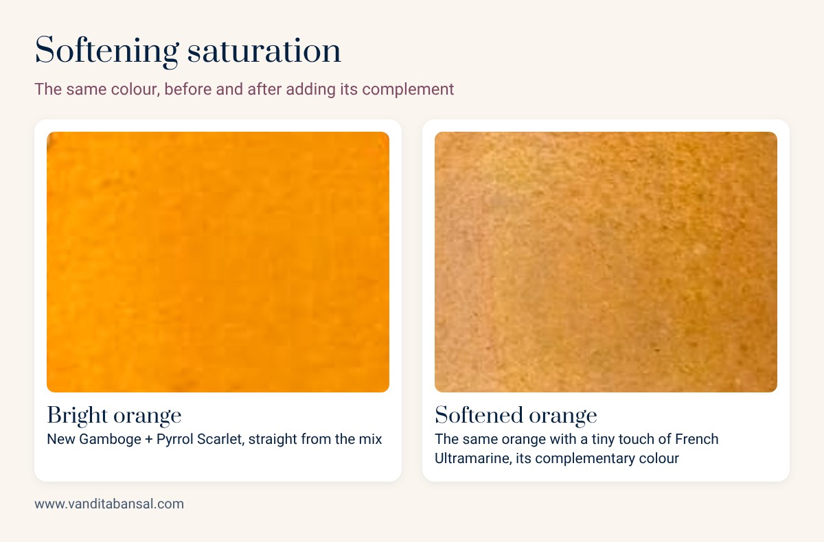
Most colours in nature are softer than paint straight from the tube. To calm a colour down, add a tiny touch of its complementary colour, the one directly opposite it on the colour wheel: green and red, blue and orange, yellow and violet. Go slowly: one small touch can be enough, and too much tips into brown.
Let’s mix four colours from one book cover
In my video, I picked up a book with a beautiful cover and matched four of its colours. There’s no green, orange or grey tube in my six paints, and I didn’t need one.
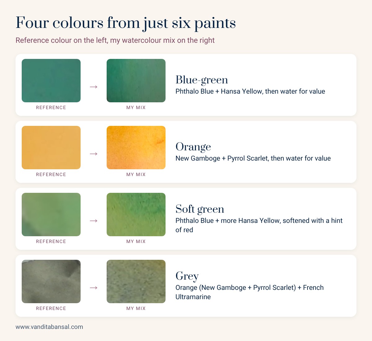
I balanced the blue and yellow, then added water until the value matched.
I adjusted the yellow and red, then added water for value. No complement needed.
It was too bright, so I added a hint of red, its complement, to soften it.
Complementary colours make neutrals. I kept adding blue until it was less warm, testing with water.
The grey took the longest. I kept going back and forth between orange and blue until it matched. That’s normal: colour mixing is a little bit of trial and error, every single time.
Try this today
Pick one object in your home, a cup, a flower or a cushion, and mix its colour using these four steps. Paint a small swatch after each step so you can see how the colour changes.
Common mistakes
- Adding a third, fourth and fifth colour to rescue a mix. Start again from the closest hue instead; it’s quicker and cleaner.
- Adding the complementary colour in big amounts, which turns the mix brown.
- Judging the colour while it is still wet. Let your swatch dry first.
Watch it step by step
Watch me mix all four colours in my YouTube video: How to Mix Any Colour in Watercolour With Just 6 Paints. You might also enjoy my glowing diya tutorial.
Hue, value, saturation. Three small questions, asked one at a time. Each “wrong” swatch teaches your eye a little more.
Questions beginners ask me
How many paints do I need to mix any colour?
You can mix almost any colour with six paints: a warm and a cool version of yellow, red and blue. I use Hansa Yellow, New Gamboge, Quinacridone Rose, Pyrrol Scarlet, Phthalo Blue and French Ultramarine from the Daniel Smith Essentials set.
How do I make a colour less bright in watercolour?
Add a tiny touch of its complementary colour, the colour opposite it on the colour wheel. Blue softens orange, red softens green, and violet softens yellow. Add a little at a time so the mix doesn’t turn brown.
How do I mix grey without black paint?
Mix two complementary colours. I mix grey from orange (New Gamboge + Pyrrol Scarlet) and French Ultramarine, adjusting the balance until it is neither too warm nor too cool, then adding water to lighten it.
Why does my watercolour look lighter when it dries?
Watercolour dries lighter than it looks when wet. Always test your mix on a scrap of the same paper and let it dry before you judge the value.
Want to learn colour with me?
My 4-week online series Magical Watercolour Beginnings starts Saturday 21 November, live on Zoom with recordings.
Free download: my watercolour supply guide
Not sure what to buy? My free guide lists exactly what I use (paper, paints, brushes and masking fluid) and where to buy each one online in India. It’s a good place to start.


