When I decided to take painting seriously, I bought supplies. Probably 25 to 30 colours, and 8 to 10 brushes. No one told me I could start with only a few art supplies.
If you are standing in an art shop right now, looking at a set of 24 or 36 colours, I want to tell you what no one told me. A palette does not need to be big. It needs to be yours, and you need to know where everything lives.
This is my palette.
1. Begin with six colours
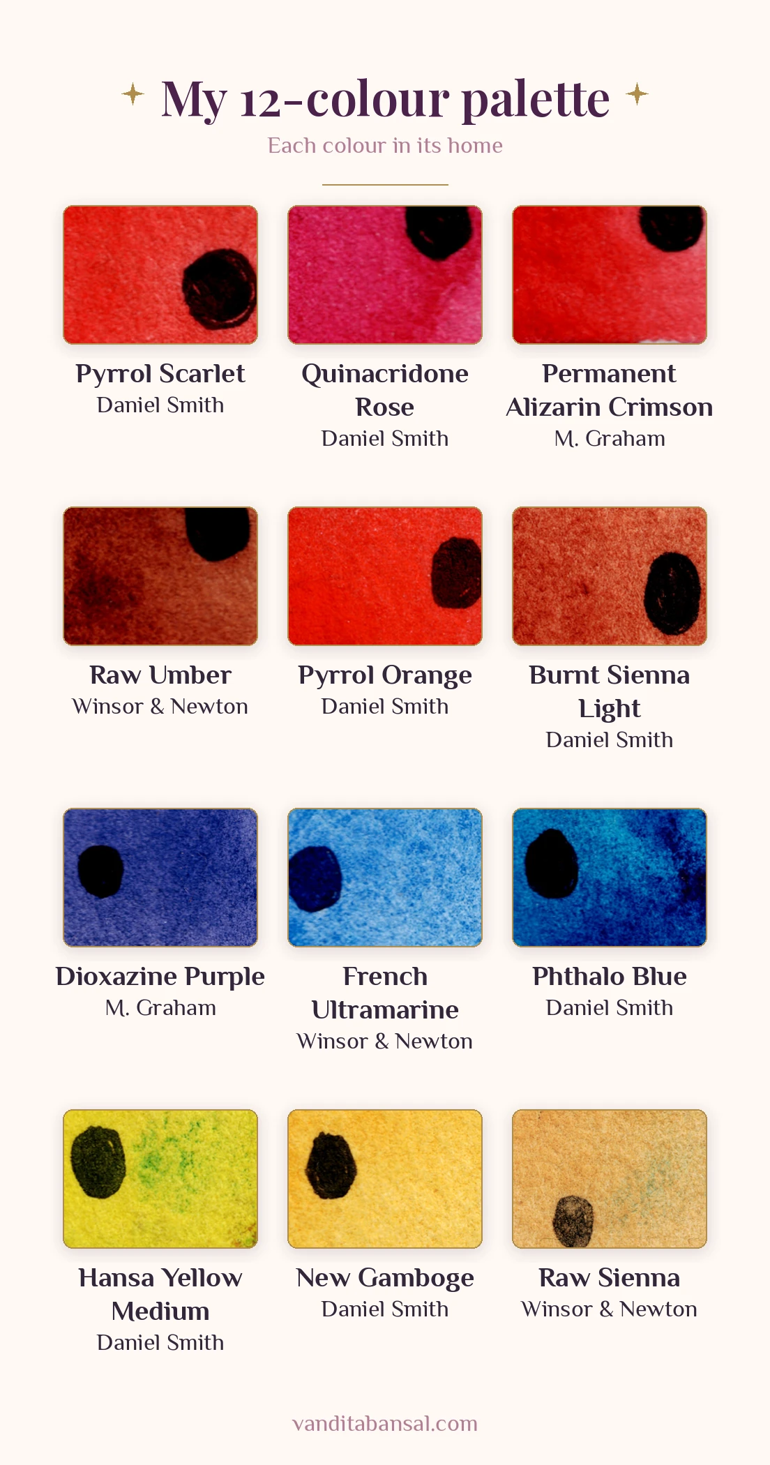
The heart of my palette is a warm and a cool version of each primary colour:
- Yellows: New Gamboge (warm) and Hansa Yellow Medium (cool)
- Blues: French Ultramarine (warm) and Phthalo Blue (cool)
- Reds: Pyrrol Scarlet (warm) and Quinacridone Rose (cool)
With these six you can mix bright oranges, greens and violets. I explain how in How to Mix Any Colour in Watercolour With Just 6 Paints.
2. Add a few earth colours
Next come the earths. On my card they are Raw Sienna (Winsor & Newton), Burnt Sienna Light (Daniel Smith) and Raw Umber (Winsor & Newton).
Why these three? Many times in painting we need darker, muted colours. As a colour gets darker, its value drops, and usually its saturation drops too. A common way artists darken a colour is to add its complementary colour, but a complementary can push the mix too far in the other direction.
A gentler way out, especially for yellows and oranges, which cannot go very dark on their own, is to add an earth colour from the same family: Raw Sienna for yellow, Burnt Sienna for orange, Permanent Alizarin Crimson for red, and Raw Umber for even darker mixes. This way of thinking comes from Munsell colour theory.
3. Add only the colours you reach for again and again
The last three wells hold colours I could mix, but use often enough to keep ready: Pyrrol Orange (Daniel Smith), Permanent Alizarin Crimson (M. Graham) and Dioxazine Purple (M. Graham).
Permanent Alizarin Crimson is a very good colour for mixing dark reds. Be careful when you buy it: plain Alizarin Crimson, without the word Permanent, is a fugitive colour, which means it fades over time.
Dioxazine Purple is my go-to purple. I can mix a nice purple from French Ultramarine and Quinacridone Rose, but French Ultramarine is a granulating colour, so that purple granulates too.
Pyrrol Orange is more of a convenience colour for my paintings.
This is the same rule I follow when I buy a two-pigment paint: keep a convenience colour only if you truly use it a lot. I wrote about reading the tube before you buy in How to choose watercolour paints.
4. Give every colour a home
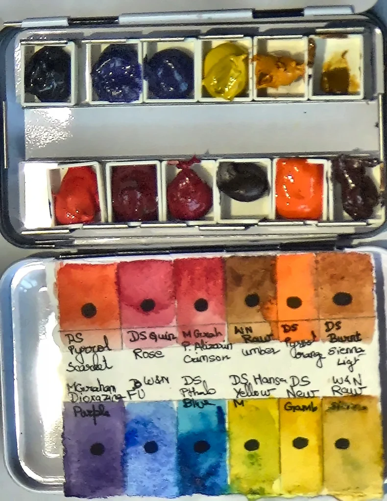
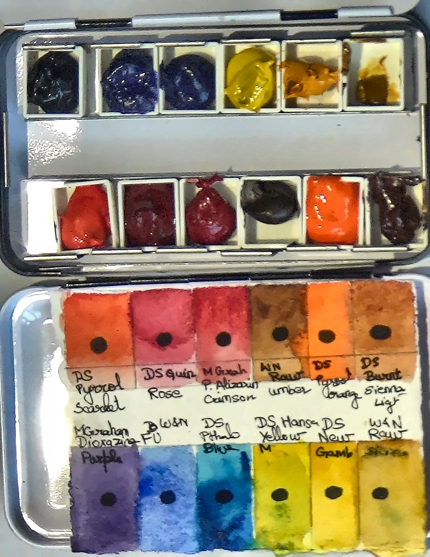
Look at the swatch card. One row holds the reds, the orange and two earth browns: Pyrrol Scarlet, Quinacridone Rose, Permanent Alizarin Crimson, Raw Umber, Pyrrol Orange and Burnt Sienna Light. The other row holds Dioxazine Purple, French Ultramarine, Phthalo Blue, Hansa Yellow Medium, New Gamboge and Raw Sienna.
5. Fill your pans and paint your card
In the photo the pans are freshly filled from tubes, so the paint is still glossy.
Squeeze the paint into each pan slowly. Then wait a day or two before you add more paint or close the lid.
Then paint a small swatch of each colour on a strip of watercolour paper, in the same order as your pans, and write the brand and the name under each one. Keep the card in the lid. It is your map.
The black dot on each swatch is my transparency test: I paint each colour over a black dot. Almost all my colours are transparent. Raw Sienna and Hansa Yellow Medium are only partly transparent, as they cover the dot a little, so when I want them to stay transparent in a painting, I mix in more water.
Think of your palette as your little box of spells. Twelve well-chosen colours, each one in its place, ready when you are.
Try this. Take the colours you already own and choose your six: a warm and a cool yellow, blue and red. Paint a swatch card in the order you will place them, and label each one with its brand and name. Then mix one orange, one green and one violet from them, and paint those at the end of the card.
Common mistake. Filling every well because the palette has room. An empty well is not a mistake. Add a colour only when you find yourself mixing it again and again.
Pause and reflect. Which colours on your palette have you never used? What would happen if you gave their wells to the colours you love?
You already have the wings. Your palette is simply where you keep them ready.
If you are setting up your first palette, my free beginners’ guide will help you choose what to start with: get it here.


