Many of us, including me, sometimes buy a colour by its name. Peacock Blue sounds like such a nice name. Or I want that turquoise colour.
Do I need to buy all the colours? Definitely not.
Before you spend your resources on buying colours, look for the following things in each colour. This is how to choose watercolour paints that will truly work for you.
Prefer to watch? I walk you through it, tube by tube, in this video:
1. Why you should not buy colours by their name
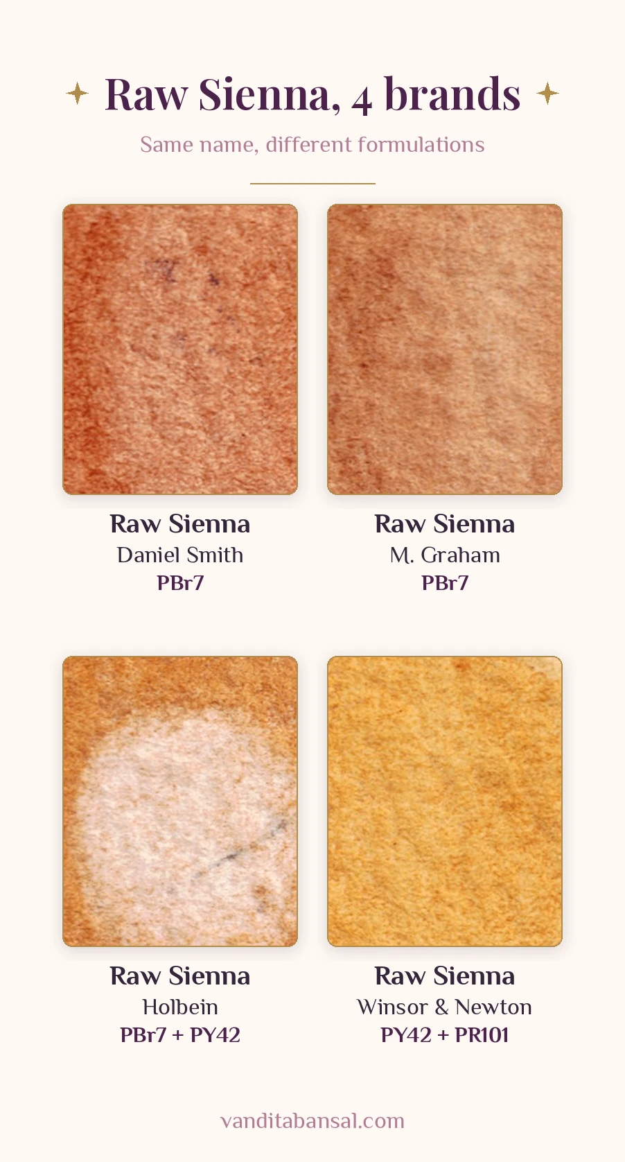
Even though the name of a colour may be the same across brands, the formulation may be different.
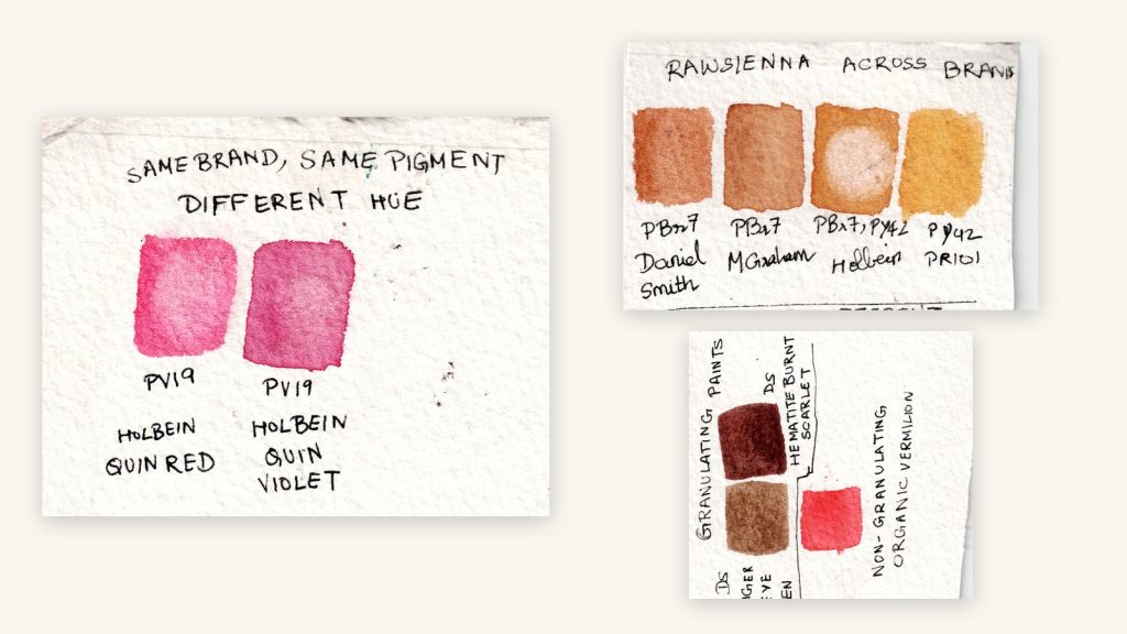
Below is an example of Raw Sienna across brands. You will notice that in each brand the colour looks slightly different, and the underlying pigments are also different.
2. Read the pigment number
All the paints out there are made from standard pigments, so all internationally known brands give a pigment number on the tube. For example, PB29 is Ultramarine Blue and PB15:3 is Phthalo Blue.
If you look across brands, you may find the same Phthalo Blue appearing under different names.
Here are the letters you will see:
- PR – Pigment Red
- PB – Pigment Blue
- PV – Pigment Violet
- PG – Pigment Green
- PY – Pigment Yellow
- PO – Pigment Orange
- PBr – Pigment Brown
- PW – Pigment White
Once you can read these numbers, mixing becomes easier too. I show you how in How to Mix Any Colour in Watercolour With Just 6 Paints.
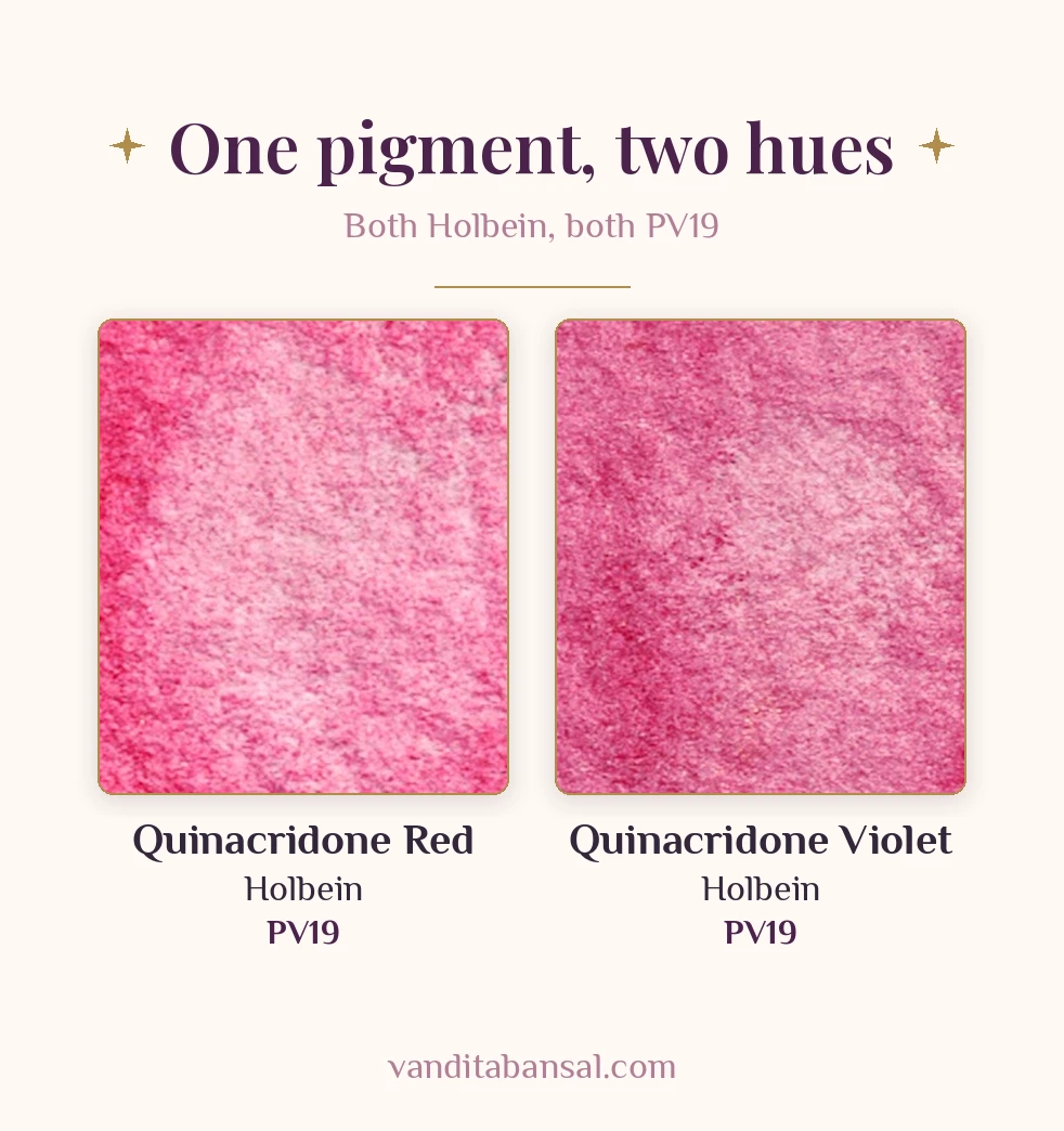
The number after the letters refers to the actual chemical composition of the pigment. And even with the same pigment number, the colour you get can differ, because the same pigment can be processed in different ways. Here are two paints from the same brand, both PV19, giving two very different hues.
Single-pigment paints
You may have noticed that artists often recommend buying single-pigment colours. The reason is that if a paint has two pigments in it and you own both tubes, you can mix that colour on your own.
Buy a two-pigment paint for only two reasons: the mix it gives you is granulating, or you use that mix a lot, so it is a convenient mix for you.
3. Check the lightfastness
Lightfastness plays a very important role. If you are an artist who wants to sell your work, I would highly recommend that you look at the lightfastness of your colours.
Lightfastness tells you how long the colour will last. Good quality paints will not fade for more than 100 years.
On many tubes you will see lightfastness as a Roman numeral on the ASTM scale. I means excellent and II means very good. If you plan to sell your paintings, choose colours rated I or II. Some brands use their own scale, so check the brand’s colour chart.
4. Know transparency, staining and granulation
The other things to keep in mind while buying colours are transparency, staining power and granulation.
Transparency
Transparency is a very important criterion for choosing pigments. Many artists who are not familiar with the transparency of colours struggle when their colours look muddy, or when their watercolour paintings start looking overworked. The key here is transparency.
Cadmium colours, which are most often used in other mediums such as oils and acrylics, should be used sparingly or in a very diluted manner. The reason is that opaque colours hide the layers below them, and with opaque colours your painting starts looking overworked.
Staining
Staining versus non-staining is a painting choice, and which colour you choose depends on your painting. Staining colours do not lift easily, and they are good for working in layers. Non-staining colours lift easily and may suit techniques that involve lifting.
Granulation
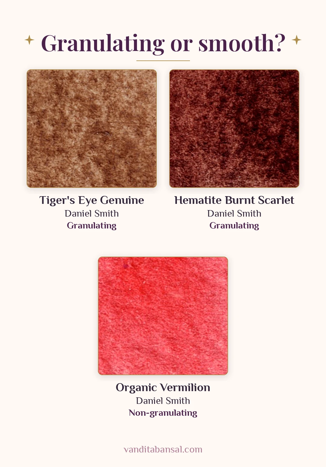
Many watercolour artists play with granulation in their artwork. Granulation means the small particles the paint leaves on the paper. In the example below you can see how Daniel Smith Tiger’s Eye Genuine and Daniel Smith Hematite Burnt Scarlet are granulating, while Daniel Smith Organic Vermilion is non-granulating.
5. Where you can find this information
Look on the brand’s website:
- Winsor & Newton: professional watercolour range
- Daniel Smith: colour charts
- M. Graham: watercolour colour chart (PDF)
Many retailers also list the pigment properties on their websites.
Reading a tube label is a little like reading the recipe of a potion. Once you know the ingredients, you know what it will do on your paper.
Try this. Before a new tube joins your palette, give it three small tests on a scrap of watercolour paper. Transparency: draw a line with a permanent waterproof black marker and paint a swatch over it. If the paint covers the line, the colour is opaque. Staining: paint a swatch, let it dry, then try to lift as much as you can with a damp brush. If it lifts completely, it is non-staining; if traces stay, it is staining. Granulation: paint a watery swatch and look for small particles settling into the paper. If you want to sell your work, also try a lightfastness test: cover half of a painted strip with black paper and leave it at a south-facing window for 3–4 months.
Common mistake. Buying a two-pigment paint when you already own both of its pigments. Read the pigment numbers first. If you can mix it yourself, you do not need the tube, unless that mix granulates beautifully or you use it every day.
Pause and reflect. Look at the tubes you already own. How many did you buy for their name, and how many for what is inside?
You already have the wings. A few well-chosen colours are all you need to fly.
If you are just beginning, my free beginners’ guide walks you through your very first steps: download it here.


